Visualization of data and simulations
In this notebook, we illustrate the visualization functions of the petab library to visualize measurements or simulations.
Some basic visualizations can be generated from a PEtab problem directly, without the need for a visualization specification file. This is illustrated in the first part of this notebook. For more advanced visualizations, a visualization specification file is required. This is illustrated in the second part of this notebook.
For the following demonstrations, we will use two example problems obtained from the Benchmark collection, Fujita_SciSignal2010 and Isensee_JCB2018. Their specifics don’t matter for the purpose of this notebook—we just need some PEtab problems to work with.
from pathlib import Path

import matplotlib.pyplot as plt

import petab
from petab import Problem
from petab.visualize import plot_problem

example_dir_fujita = Path("example_Fujita")
petab_yaml_fujita = example_dir_fujita / "Fujita.yaml"
example_dir_isensee = Path("example_Isensee")
petab_yaml_isensee = example_dir_isensee / "Isensee_no_vis.yaml"
petab_yaml_isensee_vis = example_dir_isensee / "Isensee.yaml"

# we change some settings to make the plots better readable
petab.visualize.plotting.DEFAULT_FIGSIZE[:] = (10, 8)
plt.rcParams["figure.figsize"] = petab.visualize.plotting.DEFAULT_FIGSIZE
plt.rcParams["font.size"] = 12
plt.rcParams["figure.dpi"] = 150
plt.rcParams["legend.fontsize"] = 10
Visualization without visualization specification file
Plotting measurements
For the most basic visualization, we can use the plot_problem() function.
# load PEtab problem
petab_problem = Problem.from_yaml(petab_yaml_fujita)
# plot measurements
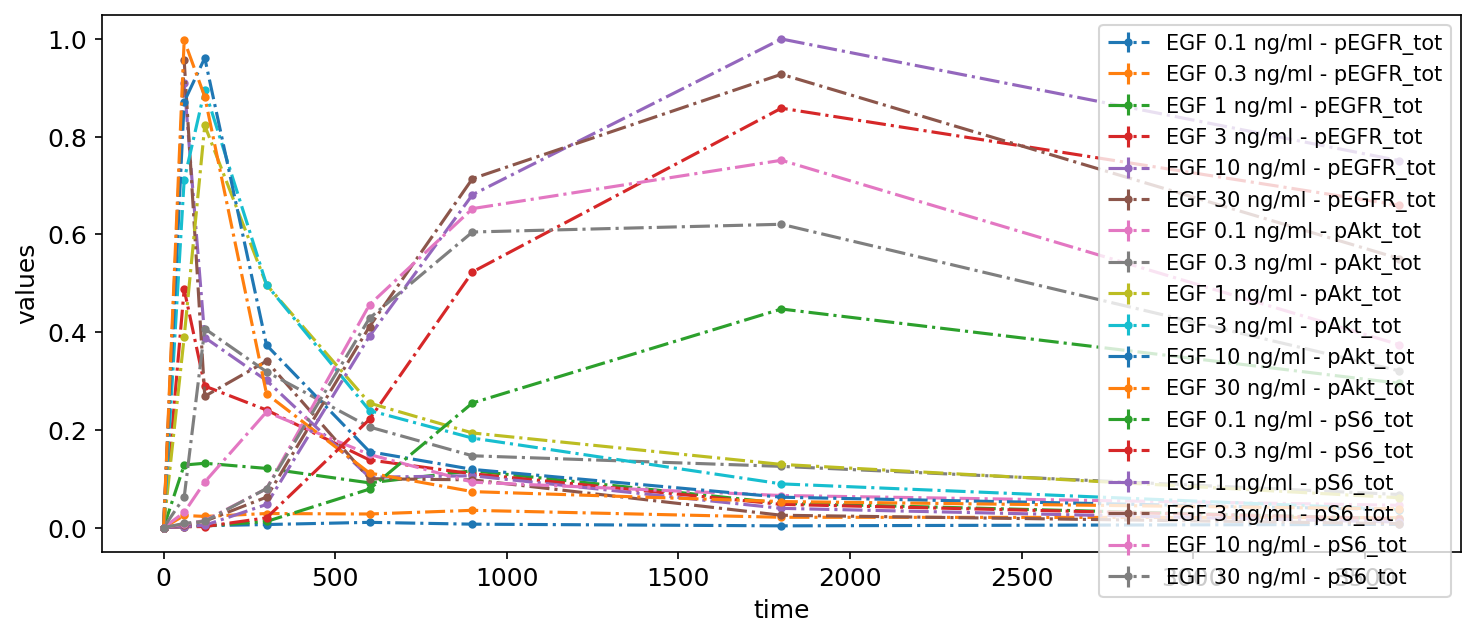
petab.visualize.plot_problem(petab_problem);
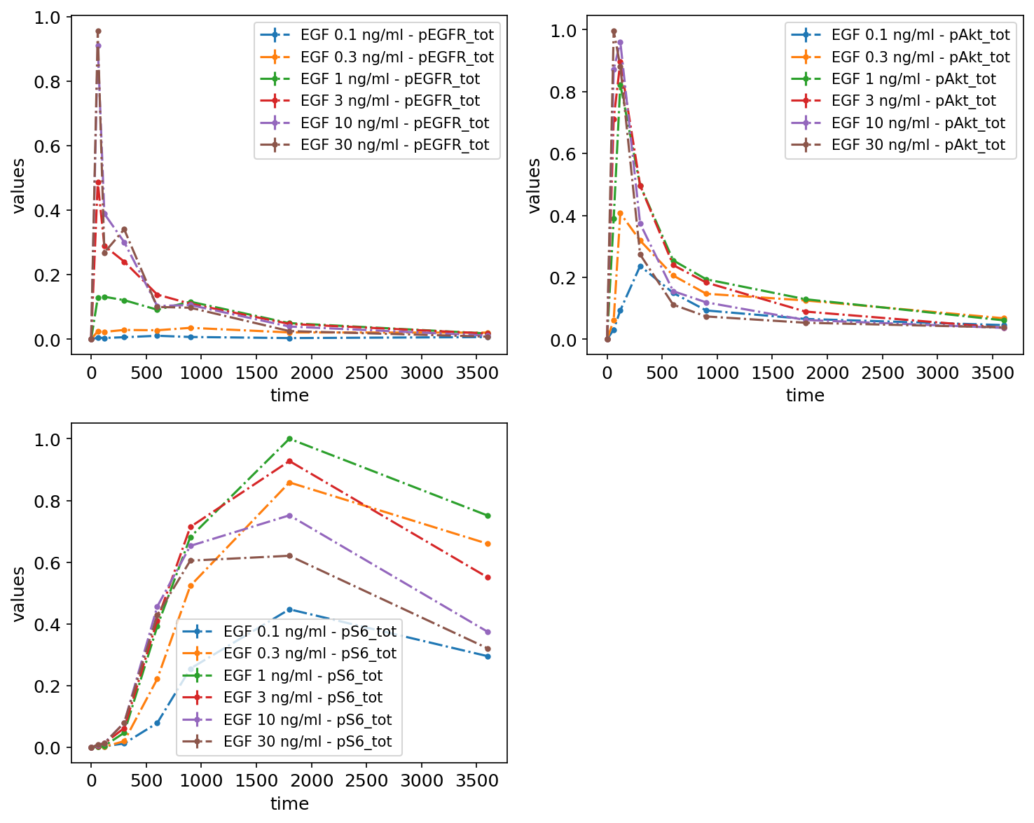
As nothing was specified regarding what should be plotted, the defaults were used. Namely, it was assumed that measurements are time series data, and they were grouped by observables.
Subplots / subsetting the data
Measurements or simulations can be grouped by observables, simulation conditions, or datasetIds with the plot_problem() function. This can be specified by setting the value of group_by parameter to 'observable' (default), 'simulation', or 'dataset' and by providing corresponding ids in grouping_list, which is a list of lists. Each sublist specifies a separate plot and its elements are either simulation condition IDs or observable IDs or the dataset IDs.
By observable
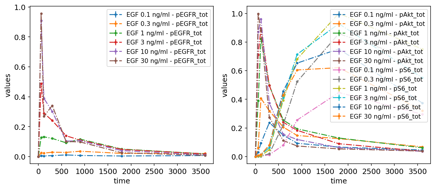
We can specify how many subplots there should be and what should be plotted on each of them. It can easily be done by providing grouping_list, which by default specifies, which observables should be plotted on a particular plot. The value of grouping_list should be a list of lists, each sublist corresponds to a separate plot.
petab.visualize.plot_problem(
    petab_problem,
    grouping_list=[["pEGFR_tot"], ["pAkt_tot", "pS6_tot"]],
    group_by="observable",
)
plt.gcf().set_size_inches(10, 4)
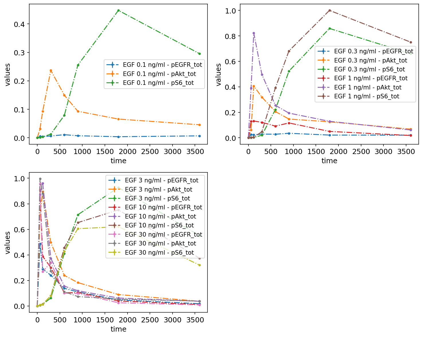
By simulation condition
Another option is to specify which simulation conditions should be plotted:
petab.visualize.plot_problem(
    petab_problem,
    grouping_list=[
        ["model1_data1"],
        ["model1_data2", "model1_data3"],
        ["model1_data4", "model1_data5", "model1_data6"],
    ],
    group_by="simulation",
);
By datasetId
Finally, measurements can be grouped by datasetIds as specified in the measurements table, by passing lists of datasetIds. Each sublist corresponds to a subplot:
petab.visualize.plot_problem(
    petab_problem,
    grouping_list=[
        [
            "model1_data1_pEGFR_tot",
            "model1_data2_pEGFR_tot",
            "model1_data3_pEGFR_tot",
            "model1_data4_pEGFR_tot",
            "model1_data5_pEGFR_tot",
            "model1_data6_pEGFR_tot",
        ],
        [
            "model1_data1_pAkt_tot",
            "model1_data2_pAkt_tot",
            "model1_data3_pAkt_tot",
            "model1_data4_pAkt_tot",
            "model1_data5_pAkt_tot",
            "model1_data6_pAkt_tot",
        ],
        [
            "model1_data1_pS6_tot",
            "model1_data2_pS6_tot",
            "model1_data3_pS6_tot",
            "model1_data4_pS6_tot",
            "model1_data5_pS6_tot",
            "model1_data6_pS6_tot",
        ],
    ],
    group_by="dataset",
);
Plotting simulations
We can also plot simulations together with the measurements, for example, to judge the model fit. For this, we need to provide a simulation file as simulations_df. A simulation file has the same format as the measurement file, but instead of the measurement column, it contains simulation outputs in the simulation column. The simulations are plotted as solid lines, while the measurements are plotted as dashed lines:
simu_file_Fujita = example_dir_fujita / "Fujita_simulatedData.tsv"

sim_cond_id_list = [
    ["model1_data1"],
    ["model1_data6"],
]
petab_problem = Problem.from_yaml(petab_yaml_fujita)
plot_problem(
    petab_problem,
    simulations_df=simu_file_Fujita,
    grouping_list=sim_cond_id_list,
    group_by="simulation",
    plotted_noise="provided",
)
plt.gcf().set_size_inches(10, 4)
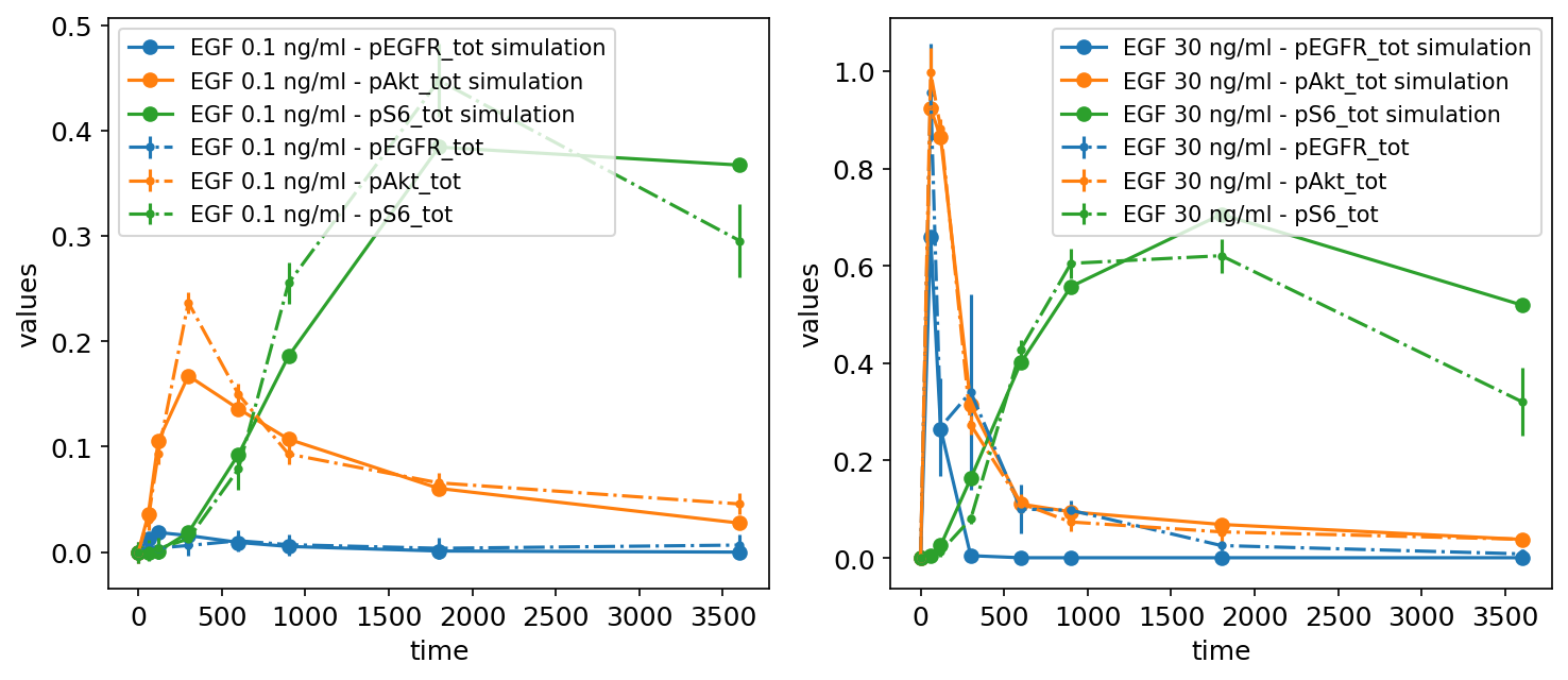
It is also possible to plot only the simulations without the measurements by setting petab_problem.measurement_df = None.
Visualization with a visualization specification file
As described in the PEtab documentation, the visualization specification file is a tab-separated value file specifying which data to plot in which way. In the following, we will build up a visualization specification file step by step.
Without a visualization file, the independent variable defaults to time, and each observable is plotted in a separate subplot:
petab_problem = Problem.from_yaml(petab_yaml_fujita)
petab.visualize.plot_problem(petab_problem);
First, let us create a visualization specification file with only mandatory columns. In fact, there is only one mandatory column: plotId.
The most basic visualization file looks like this:
petab_problem.visualization_df = petab.get_visualization_df(
    example_dir_fujita / "visuSpecs" / "Fujita_visuSpec_mandatory.tsv"
)
petab_problem.visualization_df
| plotId | |
|---|---|
| 0 | plot1 |
This way, all data will be shown in a single plot, taking time as independent variable. This is not very appealing yet, but we will improve it step by step.
petab.visualize.plot_problem(petab_problem)
plt.gcf().set_size_inches(10, 4)
Logarithmic scale and offset
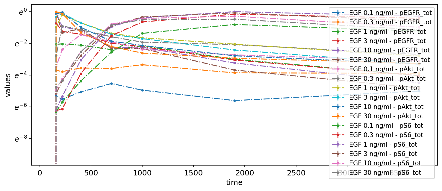
Let’s change some settings. For example, we can change the scale of the y-axis to logarithmic and apply an offset for the independent variable:
petab_problem.visualization_df = petab.get_visualization_df(
    example_dir_fujita / "visuSpecs" / "Fujita_visuSpec_1.tsv"
)
petab_problem.visualization_df
| plotId | xOffset | yScale | |
|---|---|---|---|
| 0 | plot1 | 100 | log |
petab.visualize.plot_problem(petab_problem)
plt.gcf().set_size_inches(10, 4)
Subplots by observable
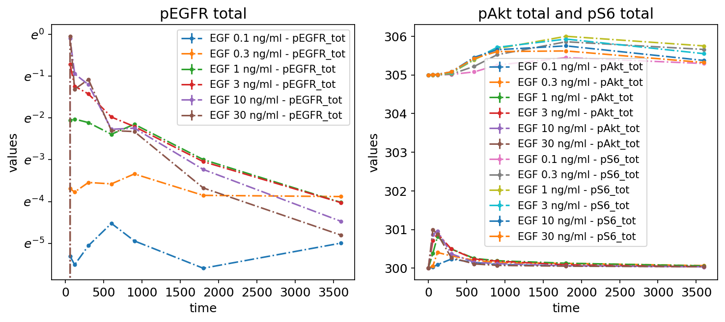
Next, to make the plot less crowded, we group the measurements by observables by adding two subplots and specifying which observables to plot on each via the yValues column:
petab_problem.visualization_df = petab.get_visualization_df(
    example_dir_fujita / "visuSpecs" / "Fujita_visuSpec_2.tsv"
)
petab_problem.visualization_df
| plotId | yValues | yOffset | yScale | plotName | |
|---|---|---|---|---|---|
| 0 | plot1 | pEGFR_tot | 0 | log | pEGFR total |
| 1 | plot2 | pAkt_tot | 300 | lin | pAkt total and pS6 total |
| 2 | plot2 | pS6_tot | 305 | lin | pAkt total and pS6 total |
petab.visualize.plot_problem(petab_problem)
plt.gcf().set_size_inches(10, 4)
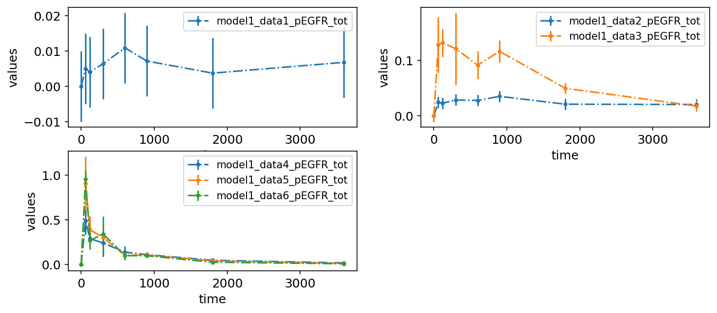
Subplots by dataset
We can also plot different datasets (as specified by the optional datasetId column in the measurement table) in separate subplots:
petab_problem.visualization_df = petab.get_visualization_df(
    example_dir_fujita
    / "visuSpecs"
    / "Fujita_visuSpec_individual_datasets.tsv"
)
petab_problem.visualization_df
| plotId | plotTypeData | datasetId | xValues | |
|---|---|---|---|---|
| 0 | plot1 | provided | model1_data1_pEGFR_tot | time |
| 1 | plot2 | provided | model1_data2_pEGFR_tot | time |
| 2 | plot2 | provided | model1_data3_pEGFR_tot | time |
| 3 | plot3 | provided | model1_data4_pEGFR_tot | time |
| 4 | plot3 | provided | model1_data5_pEGFR_tot | time |
| 5 | plot3 | provided | model1_data6_pEGFR_tot | time |
petab.visualize.plot_problem(petab_problem)
plt.gcf().set_size_inches(10, 4)
Legend entries
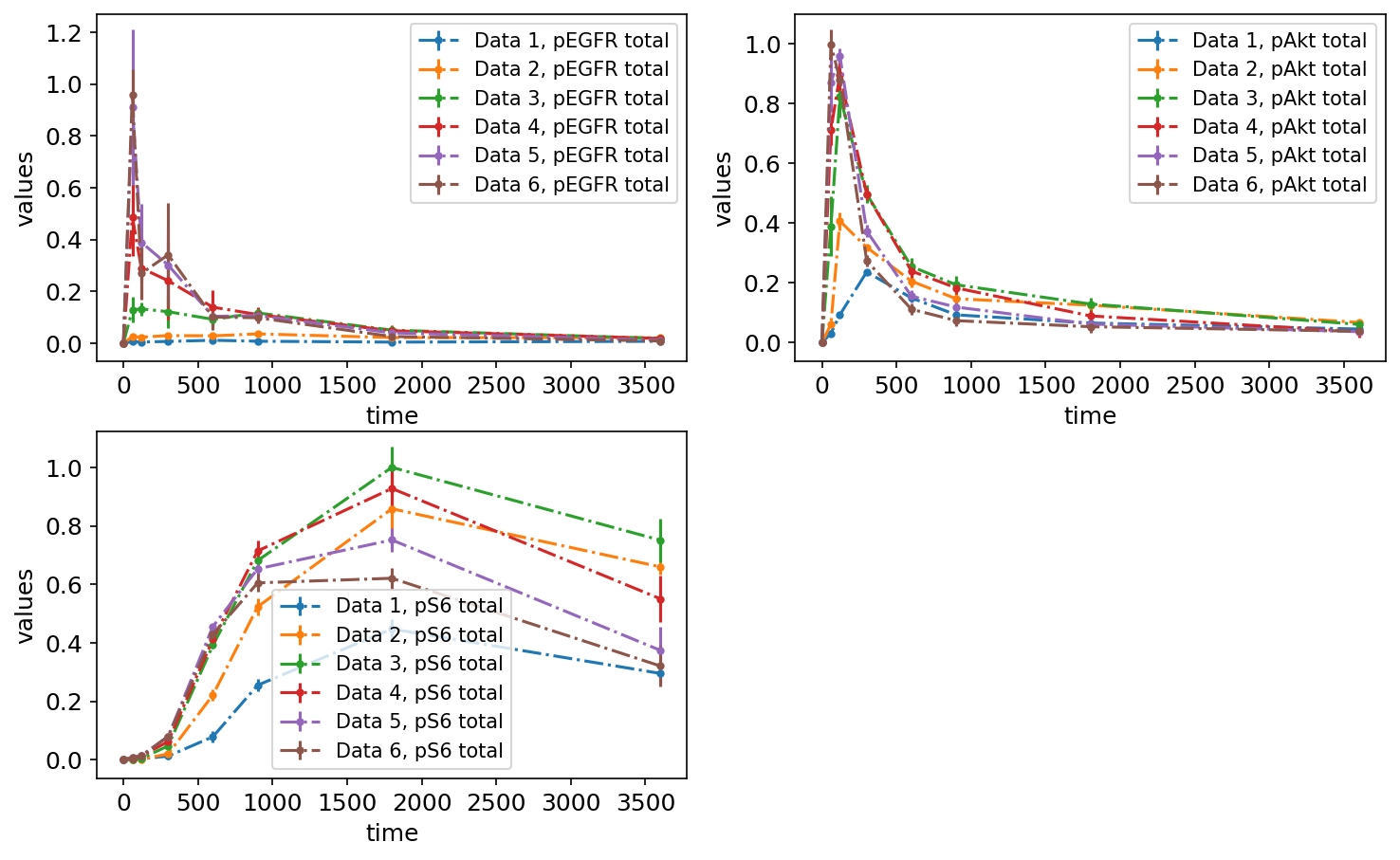
So far, the legend entries don’t look very nice. We can change them by specifying the desired labels in the legendEntries column:
petab_problem.visualization_df = petab.get_visualization_df(
    example_dir_fujita / "visuSpecs" / "Fujita_visuSpec_datasetIds.tsv"
)
petab_problem.visualization_df
| plotId | plotTypeData | datasetId | xValues | legendEntry | |
|---|---|---|---|---|---|
| 0 | plot1 | provided | model1_data1_pEGFR_tot | time | Data 1, pEGFR total |
| 1 | plot1 | provided | model1_data2_pEGFR_tot | time | Data 2, pEGFR total |
| 2 | plot1 | provided | model1_data3_pEGFR_tot | time | Data 3, pEGFR total |
| 3 | plot1 | provided | model1_data4_pEGFR_tot | time | Data 4, pEGFR total |
| 4 | plot1 | provided | model1_data5_pEGFR_tot | time | Data 5, pEGFR total |
| 5 | plot1 | provided | model1_data6_pEGFR_tot | time | Data 6, pEGFR total |
| 6 | plot2 | provided | model1_data1_pAkt_tot | time | Data 1, pAkt total |
| 7 | plot2 | provided | model1_data2_pAkt_tot | time | Data 2, pAkt total |
| 8 | plot2 | provided | model1_data3_pAkt_tot | time | Data 3, pAkt total |
| 9 | plot2 | provided | model1_data4_pAkt_tot | time | Data 4, pAkt total |
| 10 | plot2 | provided | model1_data5_pAkt_tot | time | Data 5, pAkt total |
| 11 | plot2 | provided | model1_data6_pAkt_tot | time | Data 6, pAkt total |
| 12 | plot3 | provided | model1_data1_pS6_tot | time | Data 1, pS6 total |
| 13 | plot3 | provided | model1_data2_pS6_tot | time | Data 2, pS6 total |
| 14 | plot3 | provided | model1_data3_pS6_tot | time | Data 3, pS6 total |
| 15 | plot3 | provided | model1_data4_pS6_tot | time | Data 4, pS6 total |
| 16 | plot3 | provided | model1_data5_pS6_tot | time | Data 5, pS6 total |
| 17 | plot3 | provided | model1_data6_pS6_tot | time | Data 6, pS6 total |
petab.visualize.plot_problem(petab_problem)
plt.gcf().set_size_inches(10, 6)
Plotting individual replicates
If the measurement file contains replicates, the replicates can also be visualized individually by setting the value for plotTypeData to replicate. Below, you can see the same measurement data plotted as mean and standard deviations (left) and as replicates (right):
petab_problem = Problem.from_yaml(petab_yaml_isensee)
petab_problem.visualization_df = petab.get_visualization_df(
    example_dir_isensee / "Isensee_visualizationSpecification_replicates.tsv"
)
plot_problem(
    petab_problem,
    simulations_df=example_dir_isensee / "Isensee_simulationData.tsv",
)
plt.gcf().set_size_inches(16, 9)
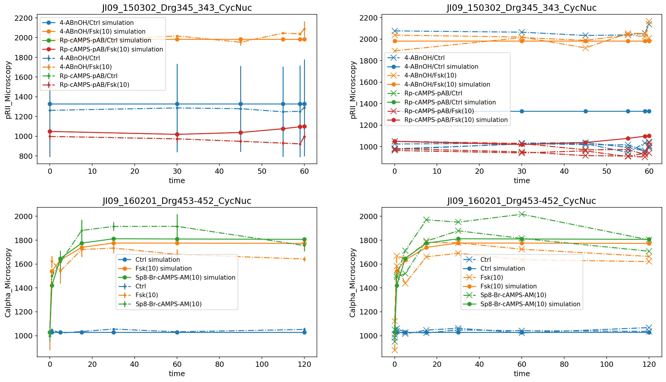
Scatter plots
If both measurements and simulated data are available, they can be visualized as scatter plot by setting plotTypeSimulation to ScatterPlot:
petab_problem = Problem.from_yaml(petab_yaml_isensee)
petab_problem.visualization_df = petab.get_visualization_df(
    example_dir_isensee / "Isensee_visualizationSpecification_scatterplot.tsv"
)
plot_problem(
    petab_problem,
    simulations_df=example_dir_isensee / "Isensee_simulationData.tsv",
)
plt.gcf().set_size_inches(10, 4)
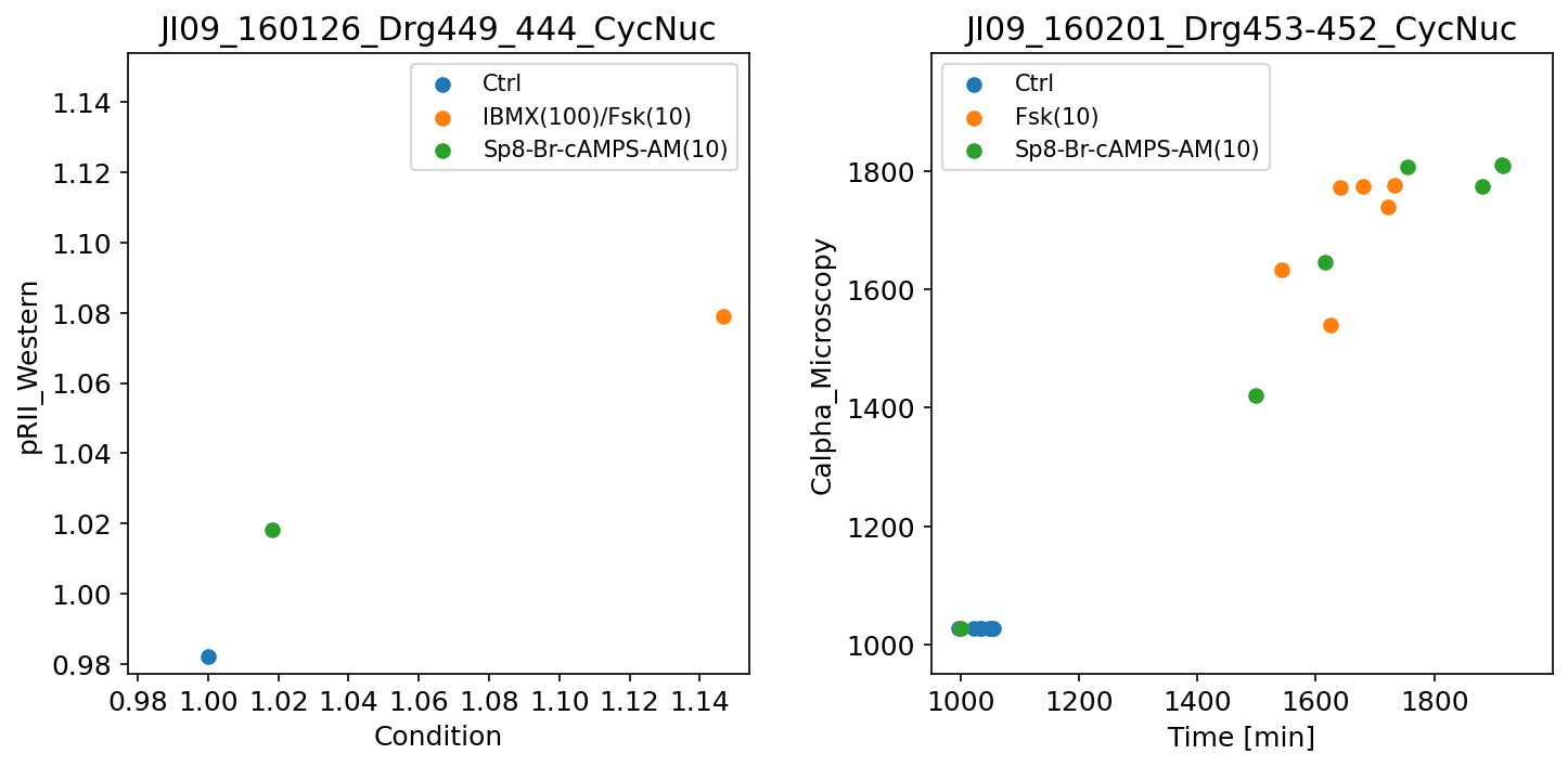
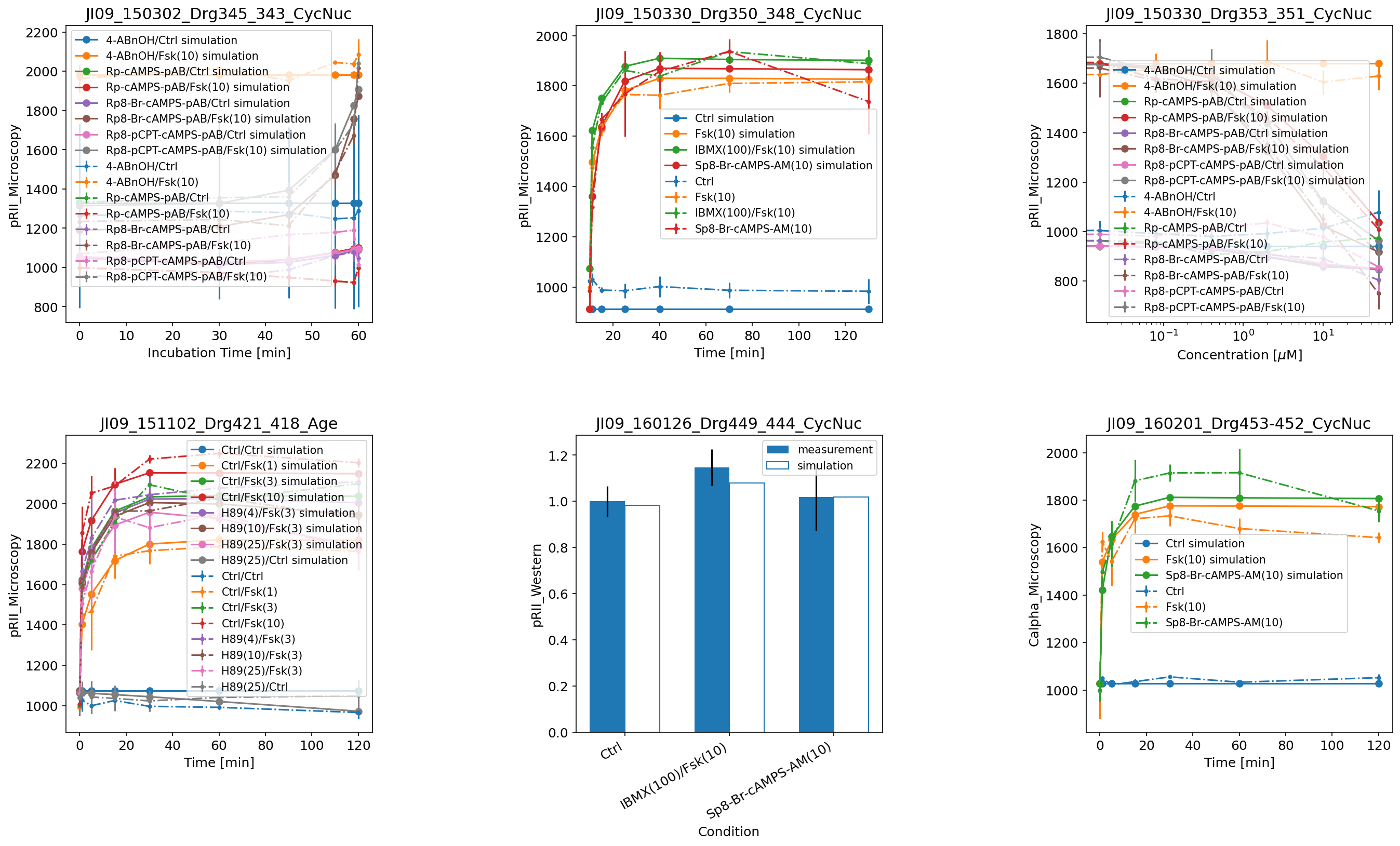
Further examples
Here are some further visualization examples, including barplots (by setting plotTypeSimulation to BarPlot):
petab_problem = petab.Problem.from_yaml(petab_yaml_isensee_vis)
plot_problem(
    petab_problem,
    simulations_df=example_dir_isensee / "Isensee_simulationData.tsv",
)
plt.gcf().set_size_inches(20, 12)
Also with a visualization file, there is the option to plot only simulations, only measurements, or both, as was illustrated above in the examples without a visualization file.
Refer to the PEtab documentation for descriptions of all possible settings. If you have any questions or encounter some problems, please create a GitHub issue. We will be happy to help!